EKIN ERGOK


a graphic designer building brands through identity and illustration.


works


The Corner Store
(THE MERCER)
Cherry
The Brooklyn Mirage
Heroes
Sartiano’s
Indie Beach

DOUBLES

Somme Slovi

Pearl Box

(SUB)MERCER

Bar Bambino

Merveilles
Café Louis
ICP

Form Mag

Shycook

Maak Haus Mag

Zazzy’s Pizza

Lost in Paradise

Innocent Yesterday

SNOB

Double D’s

UNION 22

Skynet Media Event

Aging Young Rebel

2GET4


personal things


Book of Creatures

Lil Monsters

Soda

Paintings


more about


ekin ergök is a brooklyn-based graphic designer specializing in visual identity and illustration. he studied graphic design at pratt institute and mimar sinan fine arts university, and brings 10 years of experience collaborating with hospitality and fashion brands. 

for all inquiries, please email:

ekinergok@gmail.com


︎ @ekin_ergok
︎  /ekinergok


Copyright © 2025 Ekin Ergok

EKIN ERGOK                   ︎

FORM MAGAZINE

Conceptual Architecture & Design Magazine

New York - 2021


︎Conceptual Design  ︎Illustrations ︎Print Design


Summary

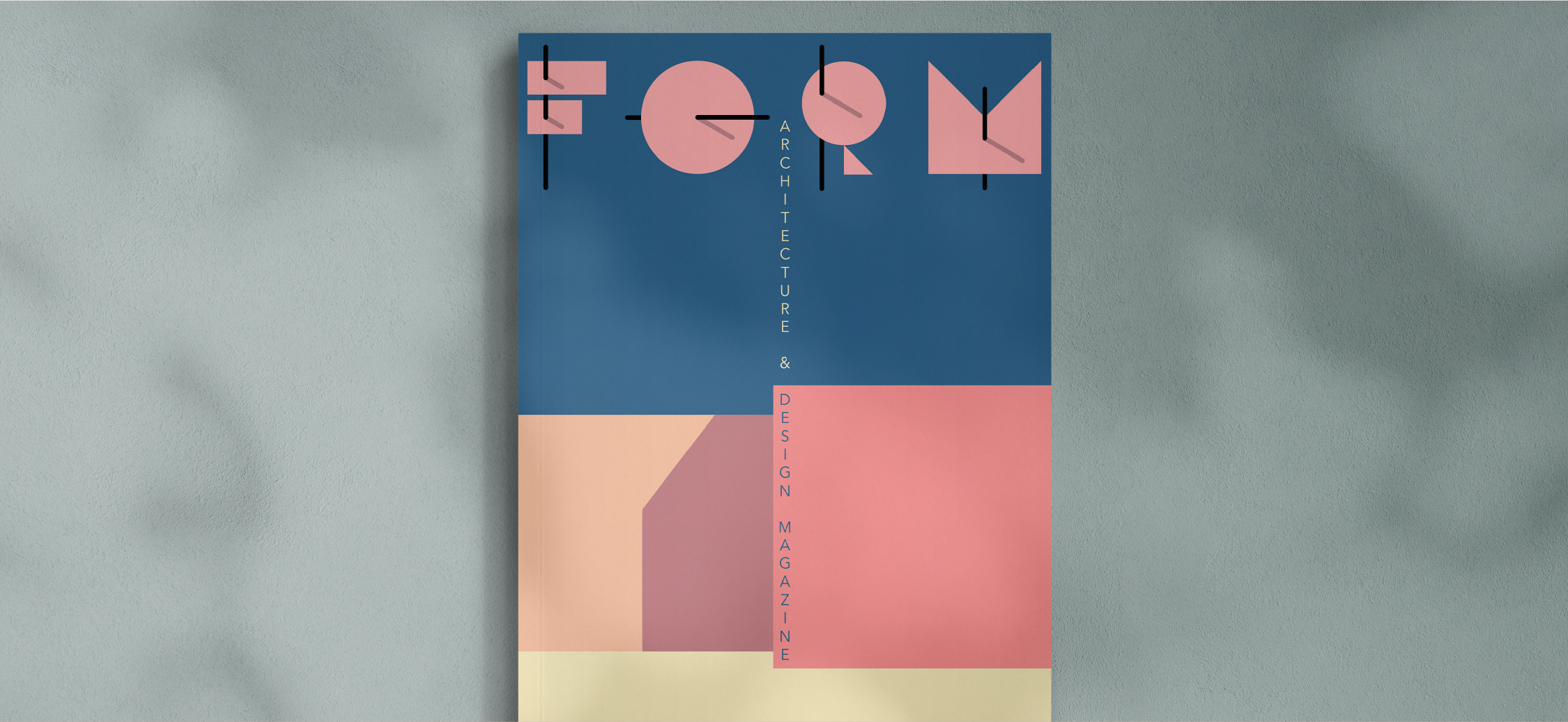
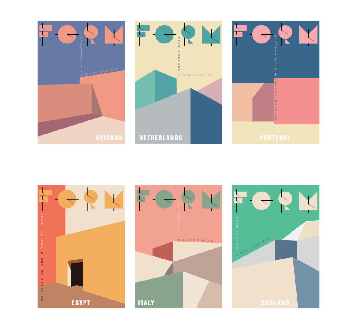
Form is a conceptual architecture and design magazine exploring the intersection of place, culture, and contemporary aesthetics. The project involved building the magazine’s brand identity from the ground up, including a custom logotype, visual system, and cover series. Each issue was designed to feature a unique color palette inspired by an iconic location around the world, creating both continuity and distinction across editions.

The scope of work included:

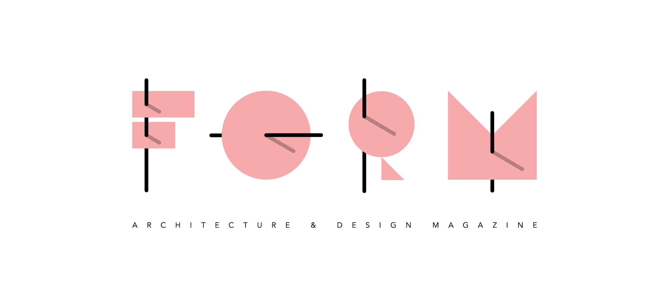
  1. Logo Design: Created a custom typographic logo that evokes a clean, modern architectural sensibility. The logotype serves as a timeless foundation adaptable across print and digital applications.

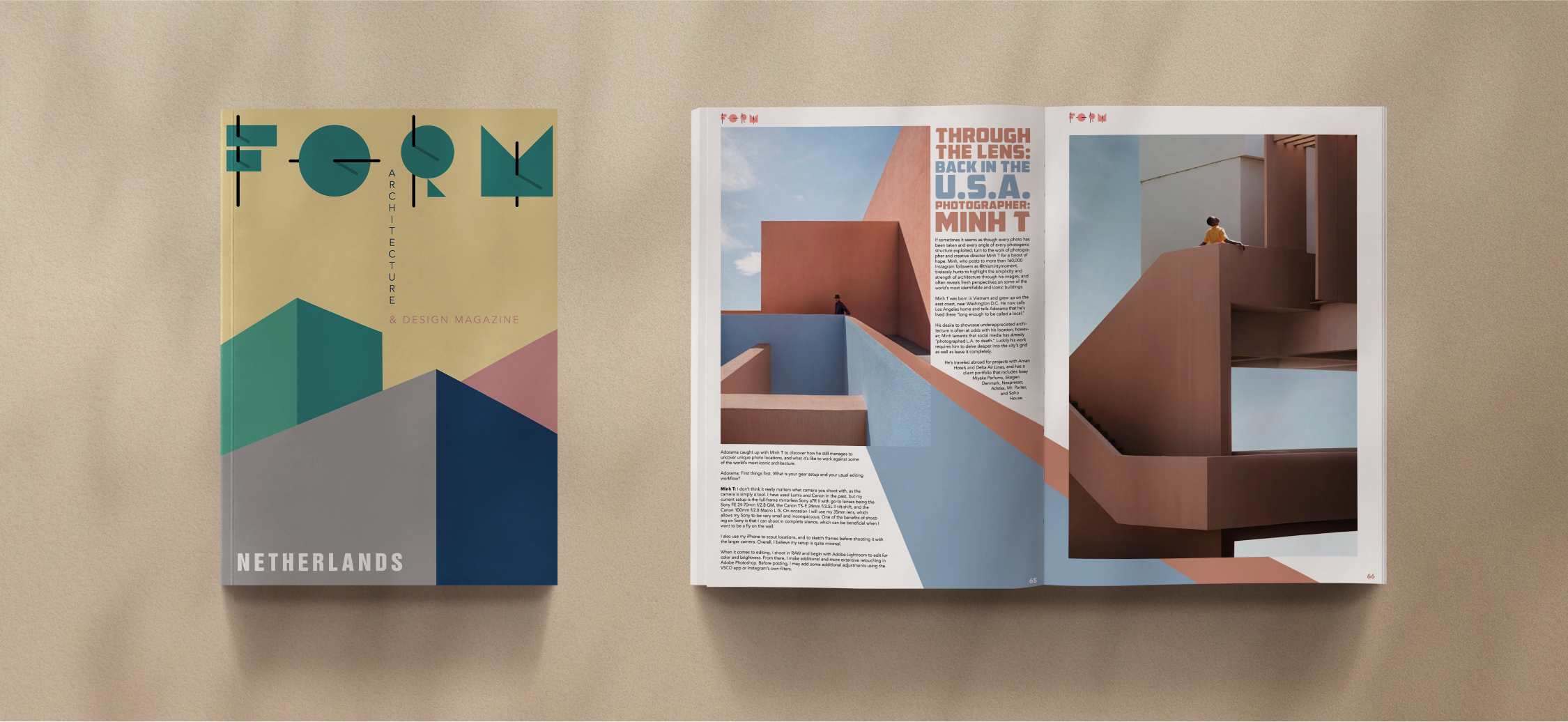
  2. Cover Design: Developed a system for magazine covers that combines graphic minimalism with cultural storytelling. Each issue features a distinct color palette tied to an iconic global location, reinforcing the magazine’s conceptual theme.

  3. Illustrations: Designed supporting illustrations to complement cover art and editorial features, adding depth and visual variety to the overall identity.

  4. Print Design: Oversaw the layout and design of the physical magazine format, ensuring a cohesive balance between text, imagery, and negative space.


Goal

The project’s goal was to establish a contemporary and culturally attuned brand identity for Form. By uniting architectural precision with graphic storytelling, the identity creates a flexible system that highlights global locations while maintaining a consistent visual voice. The work ensures that each issue feels distinct yet connected, reflecting the magazine’s vision of architecture and design as a universal cultural language.

Client

Form Magazine is a conceptual publication based in New York that reimagines architecture and design publishing through a global cultural lens. Each issue is dedicated to a different location, with a distinctive color palette and visual identity that captures its essence. The magazine serves as both a design object and a platform for exploring how architecture and culture shape the way we experience the world.


  ︎︎︎ Back                                         Next ︎︎︎